Menards

Menards Redesign Sign In

Introduction

Menards is a family-owned home improvement retail chain. With over 300 stores primarily in the mid-west the company has thousands of products and services they offer their customers.  In the last 5 years, Menards saw a significant increase in customers and sales. Their growth demanded they not only upgrade their internal business systems but their e-commerce presence as well.

One of the biggest user pain points at the time was that the site was not responsive. We had a dedicated mobile version as well as desktop, but a lot of the mobile-web version was outdated. Requirements from upper management were to keep the skeleton and core layout/flow of Menards.com the same (unless requested), but give it a modern facelift while making it responsive.

Role: UI Designer
What I Did:

Header & Navigation

Menards Header Old Design

The original design (shown above) was outdated, lacked modern aesthetics, and needed to allow for a better overall user experience.

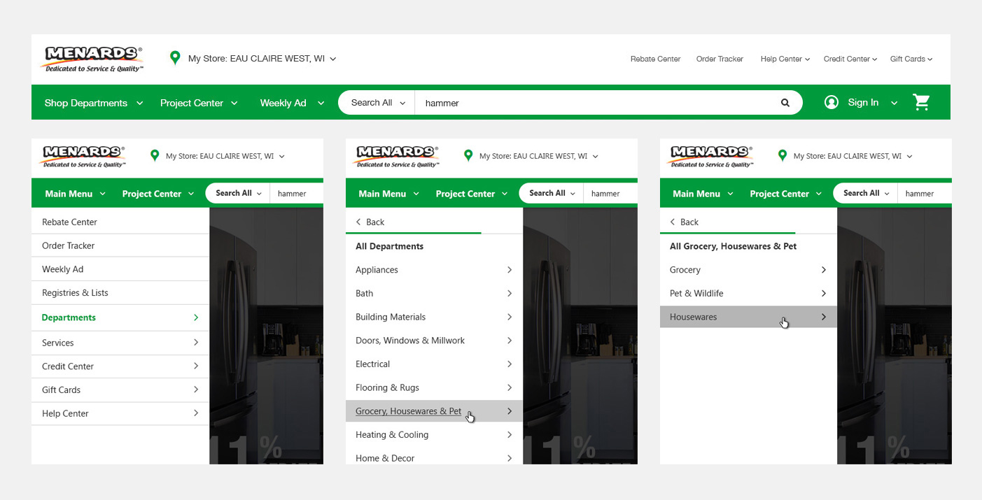
Early iterations (shown below) revealed the navigation, though designed with a mobile-first intent, would not be the best experience for users on a desktop. The reason for this was that the additional click-throughs within the Department links were just not user-friendly on desktops. However, that being said– this navigation was used for mobile, but we ultimately decided on a different route for desktop. You can see early versions of the desktop/tablet prototypes here.

Menards Header Redesign

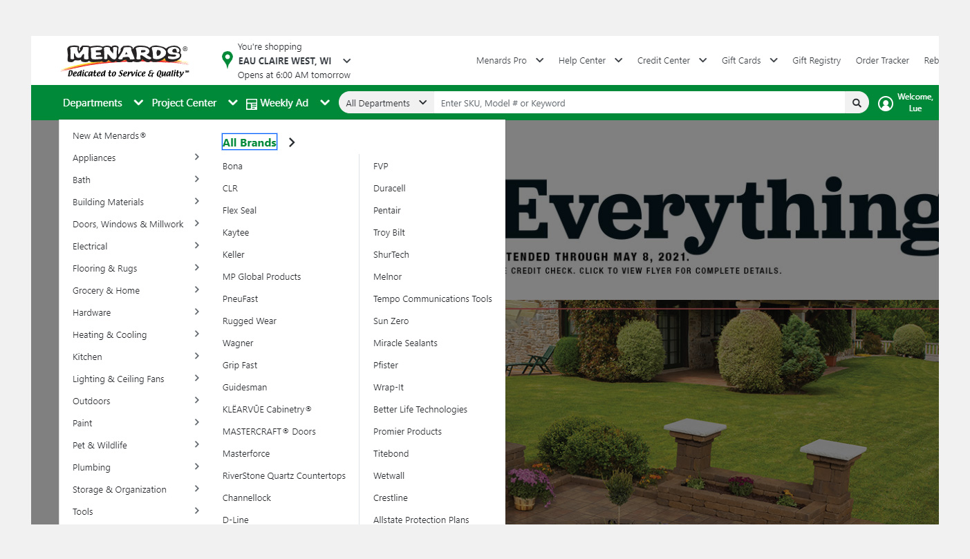
For the desktop version of the main Departments navigation (shown below), we eventually kept the flyout and updated the styles while reorganizing some links. This would allow for less click-through and the navigation would fly out with an easy hover.

Menards Navigation Redesign

Account Sign In / Create Account

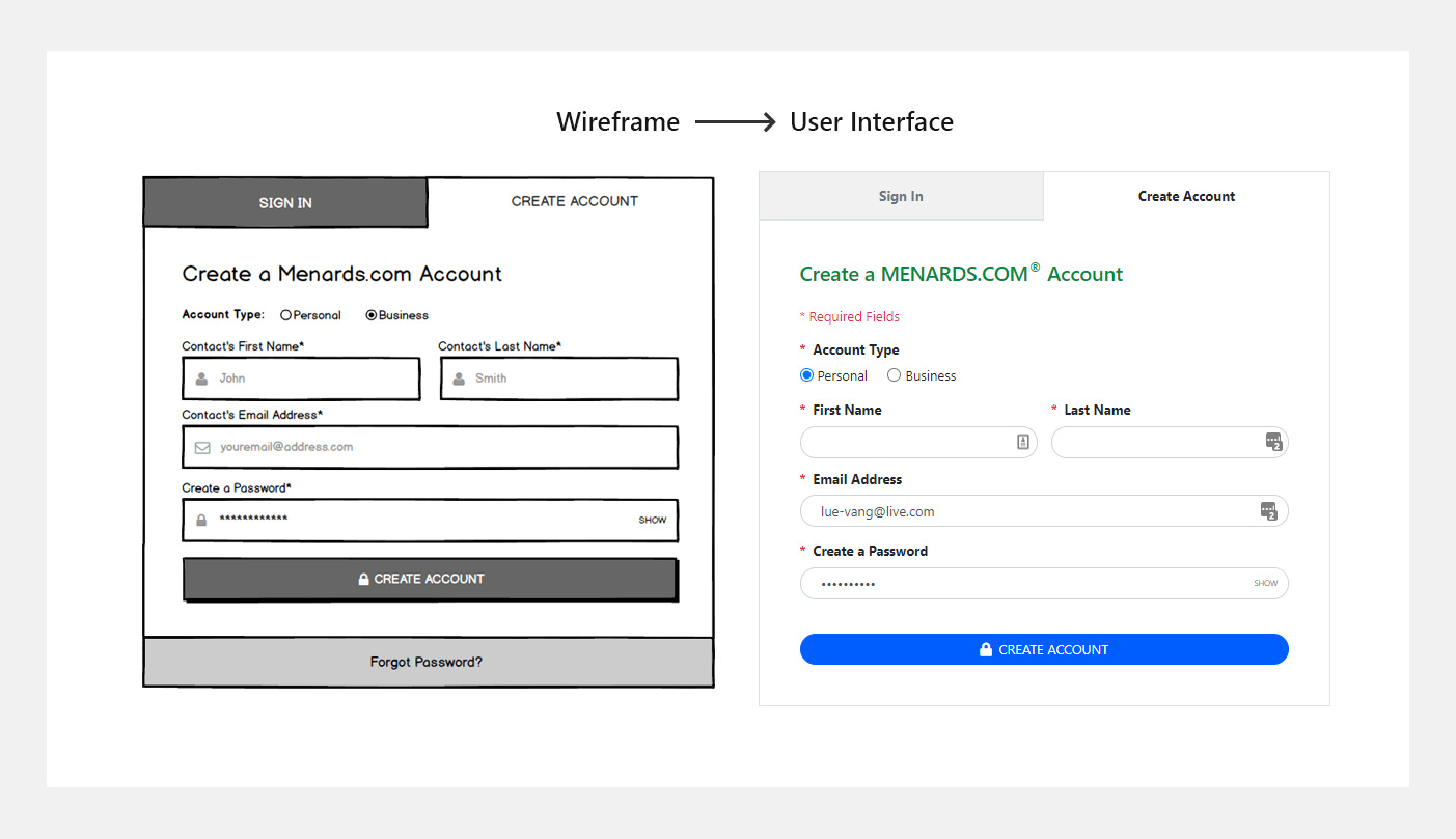
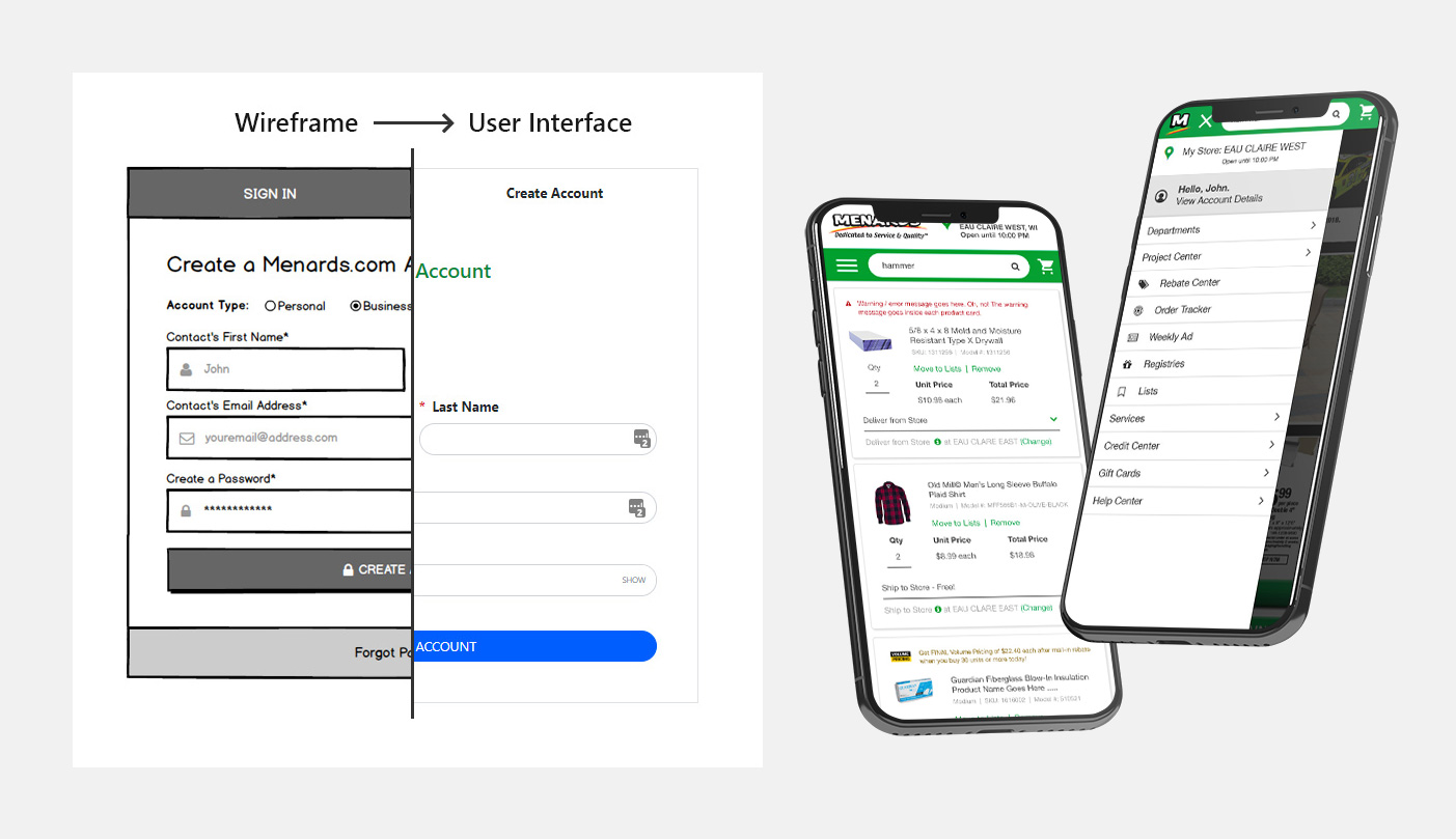
We wanted the new sign-in section form to be user and mobile-friendly. The previous form, as well as early iterations, contained fields to collect all business information that, while necessary for some business functions, did not need to simply create an account. For this reason, as well as studies showing users leaving longer forms unfinished, we kept the Create Account form as short as possible.

After Business users created their account, they would then be notified on their account profiles of further business requirements.

Menards Redesign Sign In

Cart & Checkout

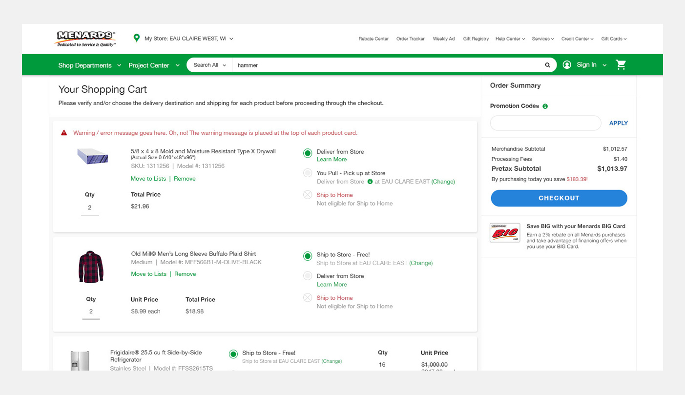
The refreshed header increased width of the entire site allowing the columns on the cart and checkout to not feel so cramped. This created some breathing room and white space to easier align certain elements inside the cart.

We had to do extensive testing and revisions on some styles because there were so many elements to this page depending on what type of products were in the cart. One particular instance was for products that had additional materials required (some optional) for purchase. You can see a short prototype of that here

Menards Cart Checkout Design

Final Thoughts

This was the largest undertaking and revamp on Menards.com in recent years and I was extremely happy to have been a part of the team to put this out. Leading the UI efforts was difficult being the only designer on the entire department, but it helped me to become a better designer by working with so many team members. By working along side several different developers throughout the iterations it gave me the opportunity to get additional input on other details I otherwise may have not thought about.

Over the course of nearly 2 years, I can say the team did a fantastic job. As we move forward and add new features/make changes I hope we continue to test and get user feedback to see how we can better improve the user experience.

LET'S CONNECT

lue-vang@live.com

Digital Services

Web Services